Totim an immersive mobile platform for documentary journalism and photography, built to help sustain the future of independent photojournalism and local storytelling. In a rapidly growing, algorithm driven, less human-prioritized news feed era, the need for true human story telling and gaining truthful, on the ground information, is more important than ever.

I was brought on board with the goal of a full overhaul of the mobile app to bring it to an investor-ready state.

Throughout this project I consulted directly with the CEO to drive high-level product direction, feature ideation, and UX framework design. During this process I also worked with the developer to discuss technical feasibility and maintain a realistic product pipeline.

I created these designs in Figma and used Adobe Illustrator and Photoshop for different assets. I implemented AI into my workflow in order to quickly test functionality and designs on the intended platform (iOS, Android and Web Browser), this was done using Claude Code along with VS Code, Android Studio and Xcode. This greatly increased our output as I was able to quickly test features without the need for involving developers, until the changes were ready to be pushed and fully implemented.

Totim is an ongoing project…

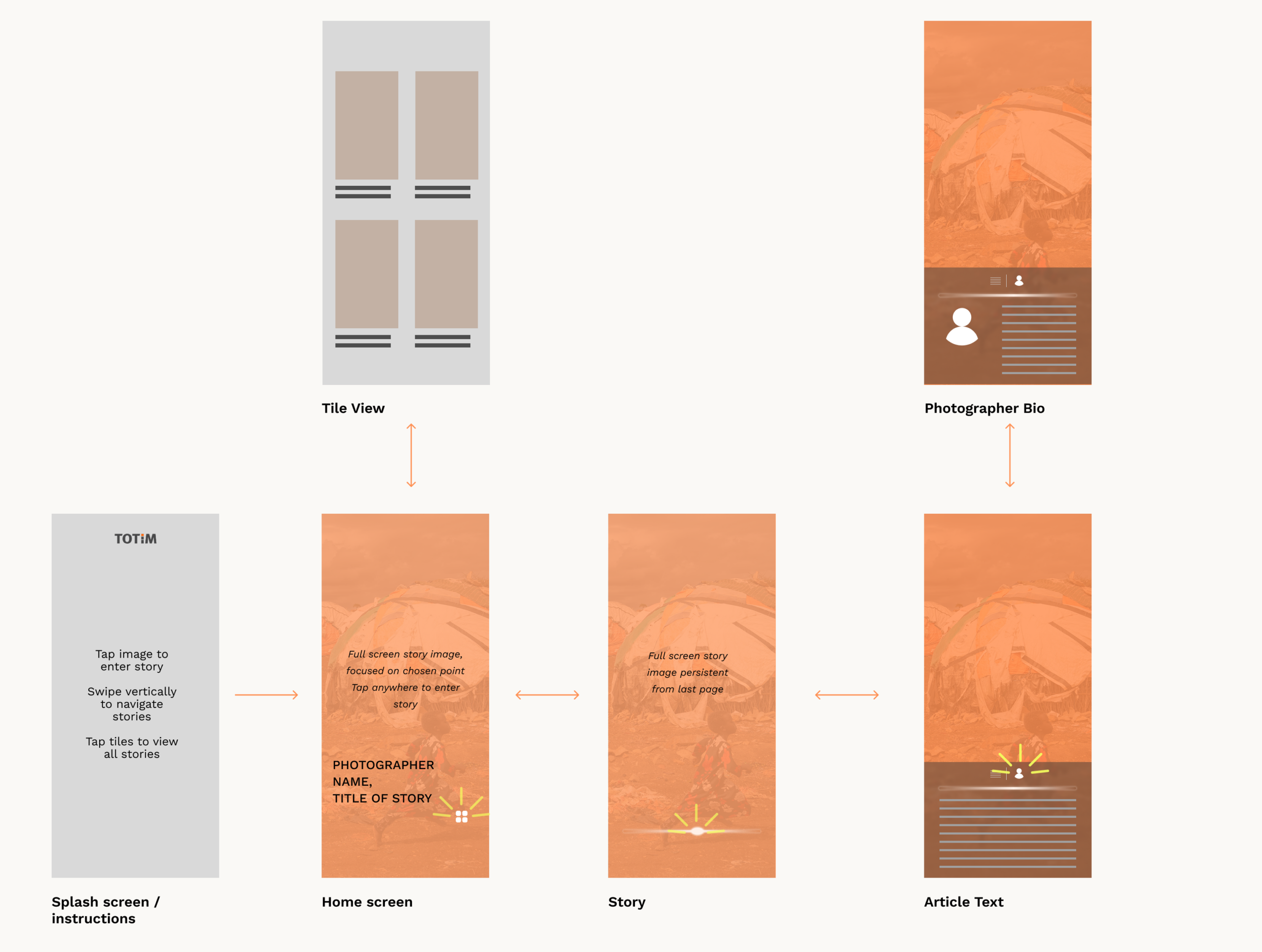
User Flow

I first started with a wireframe of the app to visualize user flow and how to maintain large photos as the main focus while still allowing for intuitive UX.

The main focus of the app are the stories, so they must be easily accessible and visually appealing so the user will want to explore them, I wanted to achieve this with full-bleed images and a vertical swiping system with snapping to full stories. This would allow users to quickly view the different stories while maintaining the photographic focus.

There are minimal steps between the home page and the story, and from there you never lose sight of the images, gaining control of looking through the different images and exploring them by zooming and panning around. These images should be visible whether the article text is visible or not.

Home Page

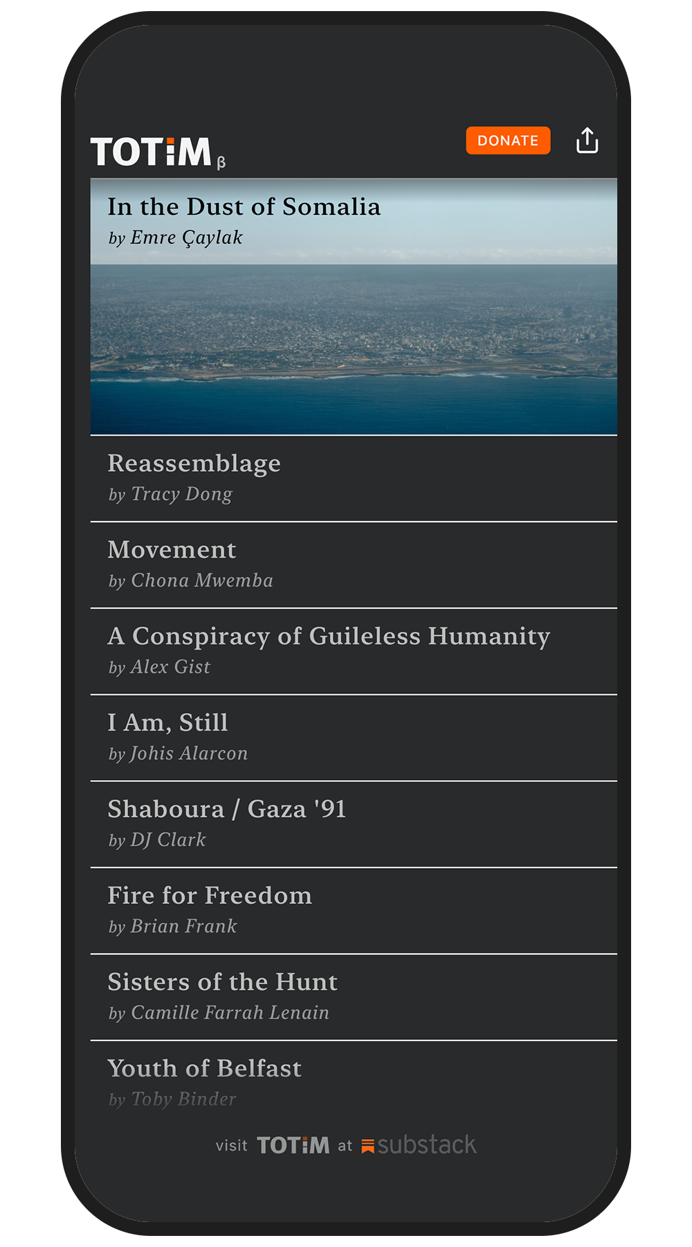
Homescreen Pre-Update

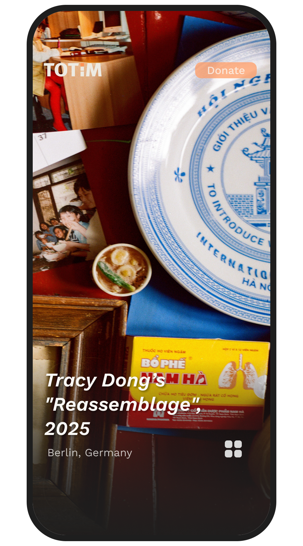
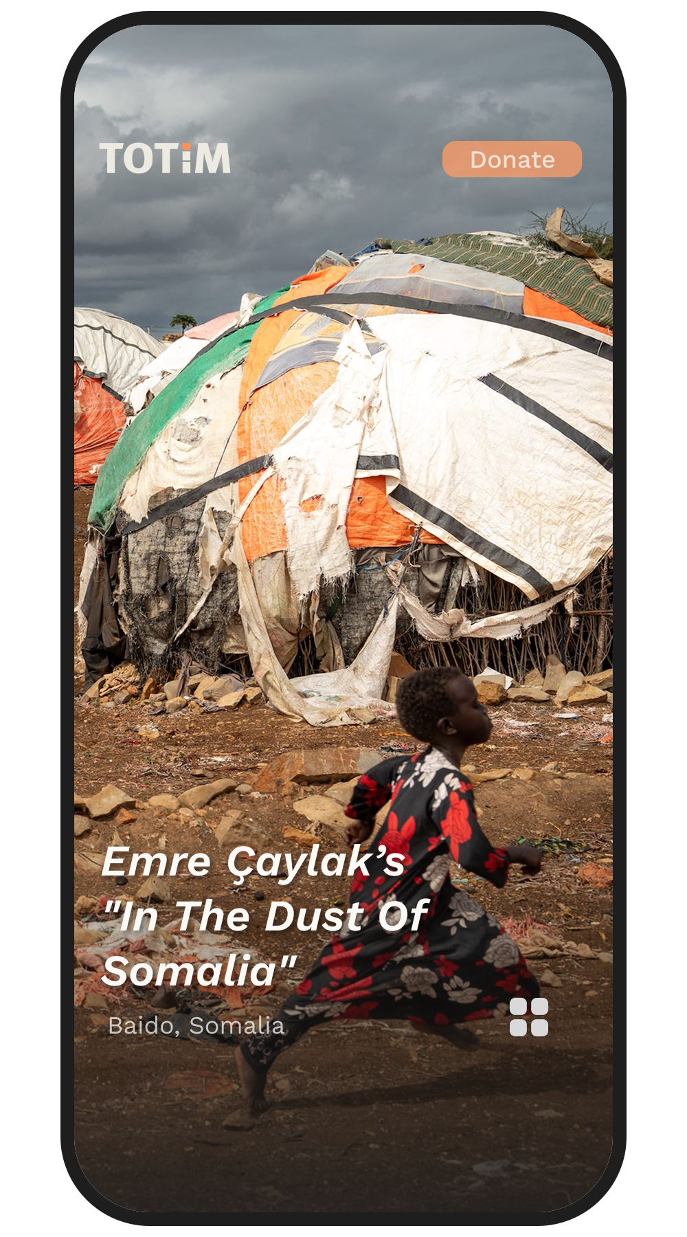
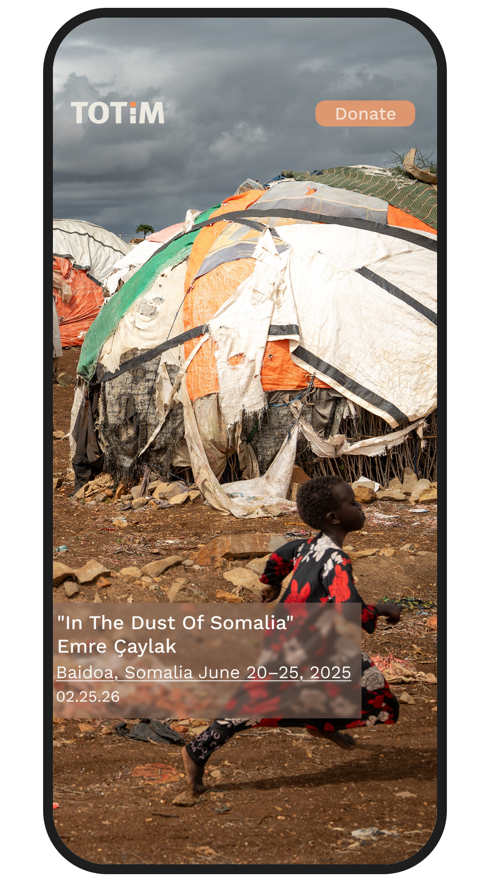
Homescreen After Redesign

As a visual-forward platform, having the photography front and center throughout the experience was a priority from the start of the redesign. The original Totim app (see left) had more text than image on screen, this was the first change I tackled as the home screen sets the tone for the rest of the app.

This went through multiple iterations, with the main concern being including crucial information but maintaining the images as the focus. Through communicating with the team we landed on a simple photographer’s name, project title, and location.

Homepage Ideation 1

Homepage Ideation 2

Homepage Ideation 3

Homepage Ideation 3

Story View

Story Before Redesign

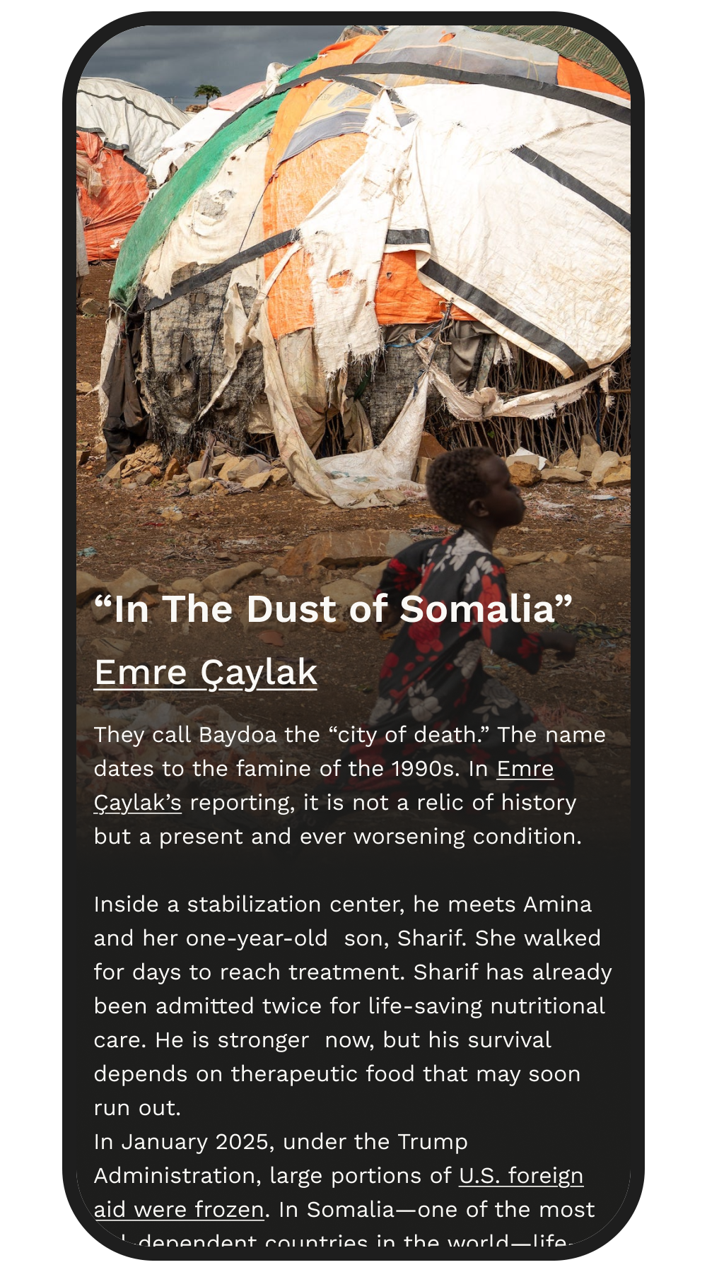
Story After Redesign

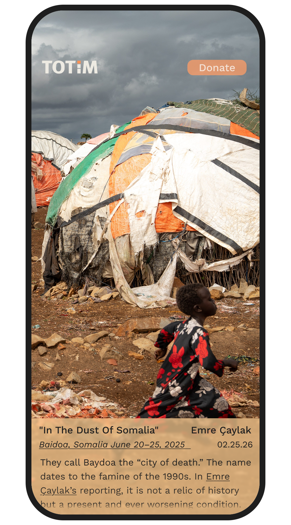
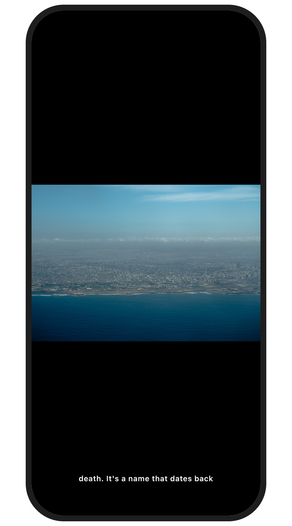
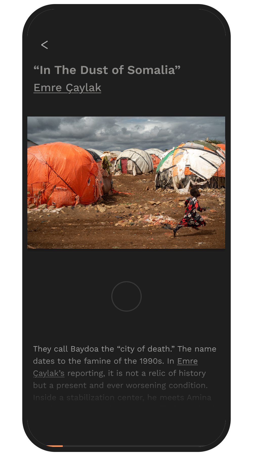
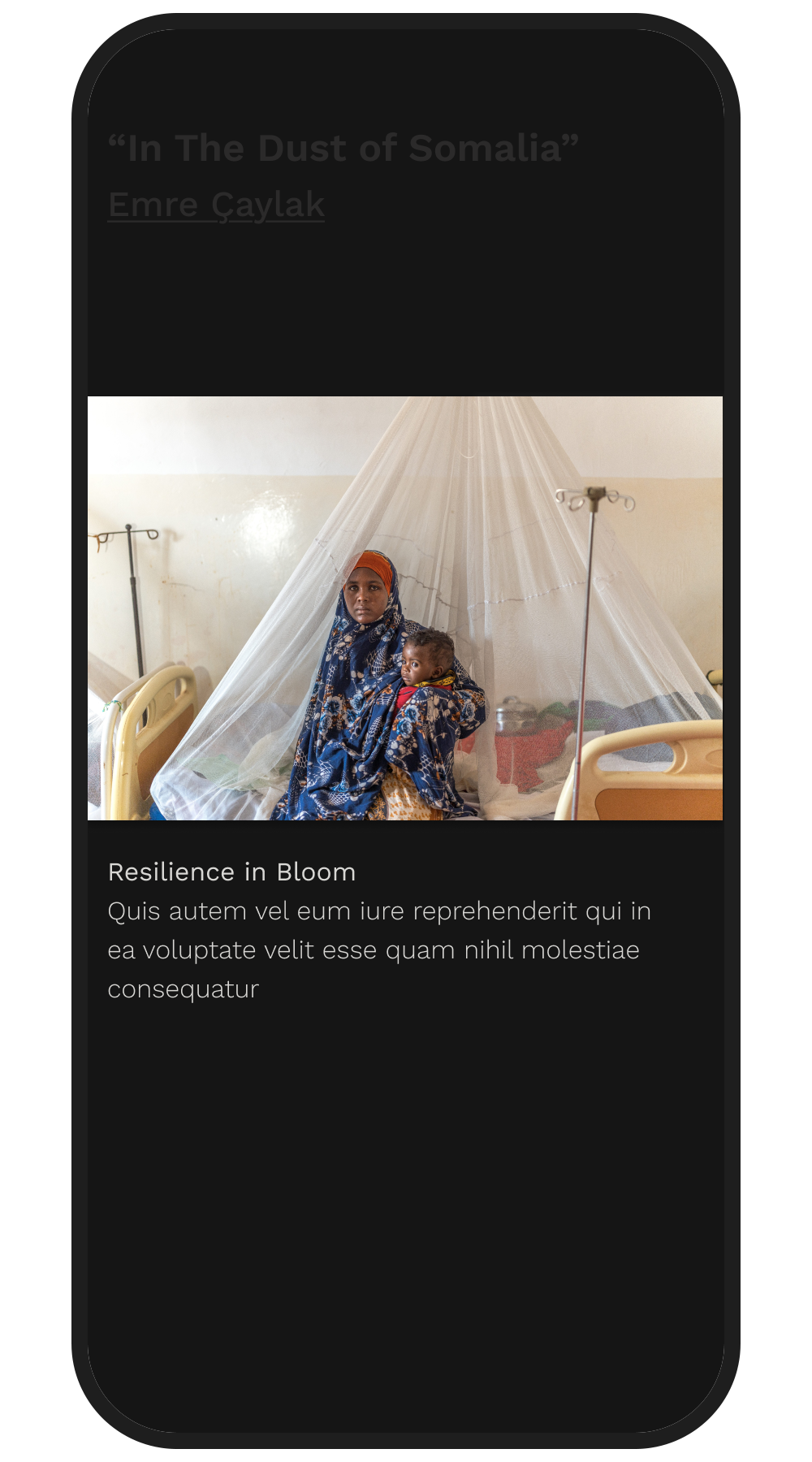
The main focus of the app are the stories themselves, which include images, audio speech from the photographer about the story, captions, as well as a longer format text article.

While keeping visuals front and center, we went through multiple ideations on how to best be able to access all these parts of the story. Keeping these key components also made it easy to link existing assets into this new design without a major back-end overhaul.

Story Ideation 1

Story Ideation 2

Article Text Ideation 1

Article Text Ideation 2

Article Text Ideation 3

Article Text Ideation 3

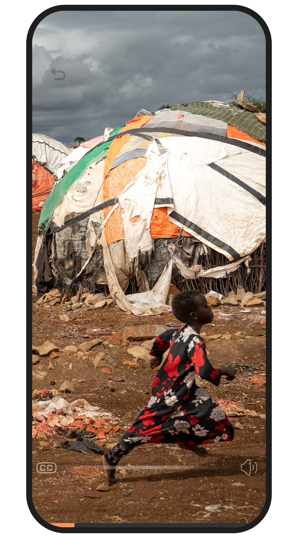
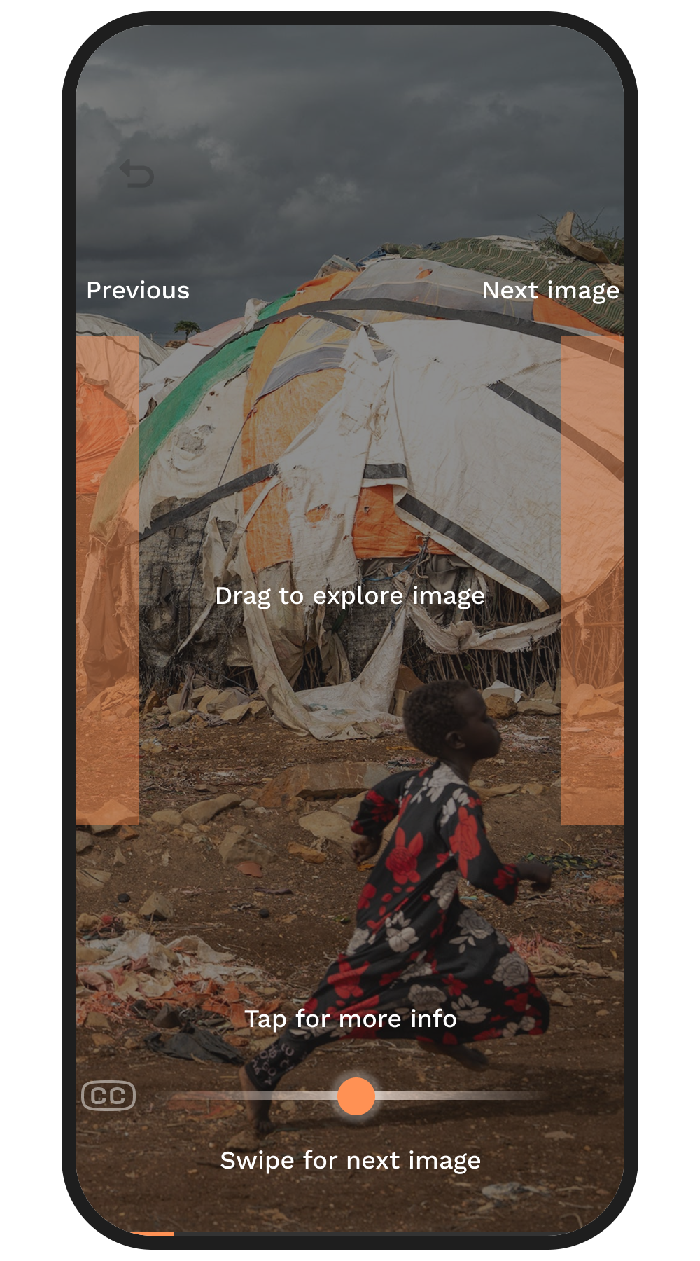
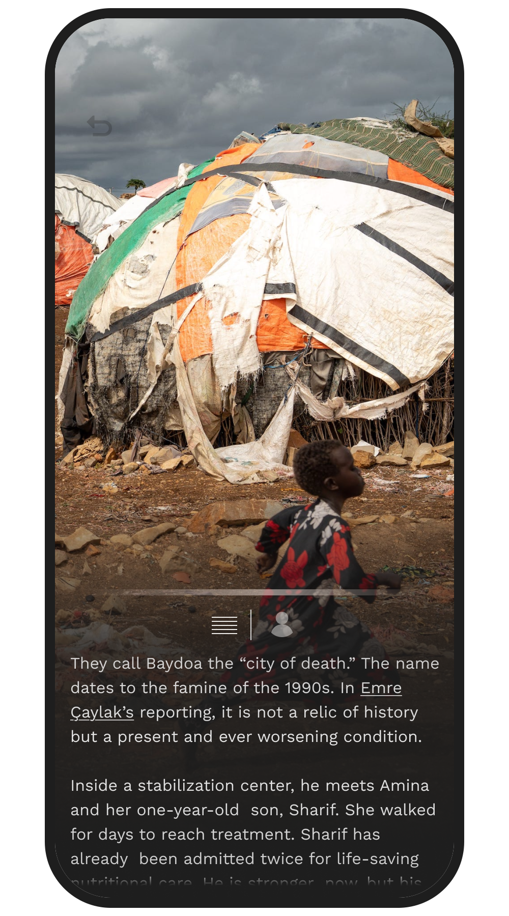
To best maintain the images as the focus, we landed on navigation based around a small glowing bar on the bottom. You can swipe on this bar to change images, allowing users to swipe around the images without accidentally switching to the next image.

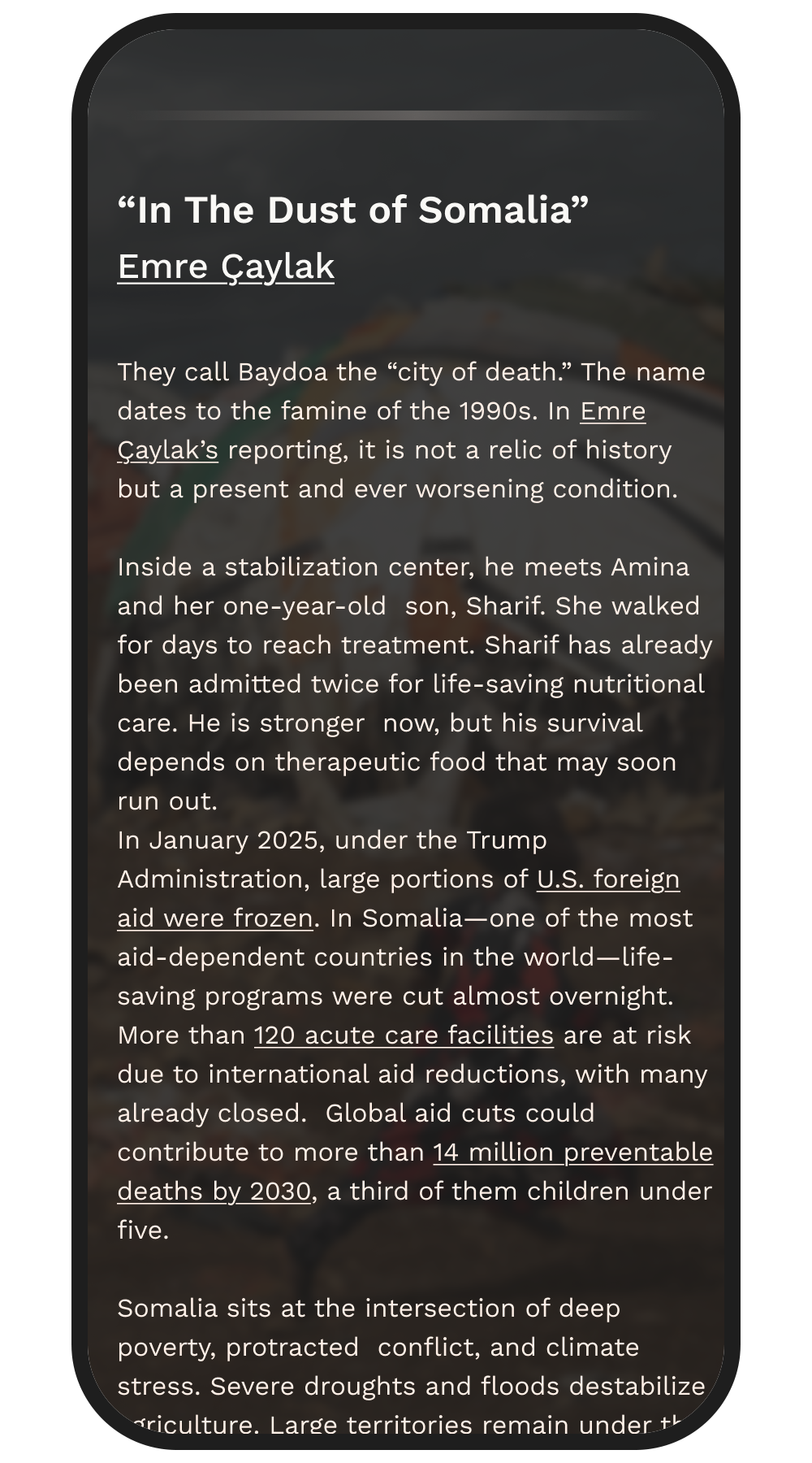
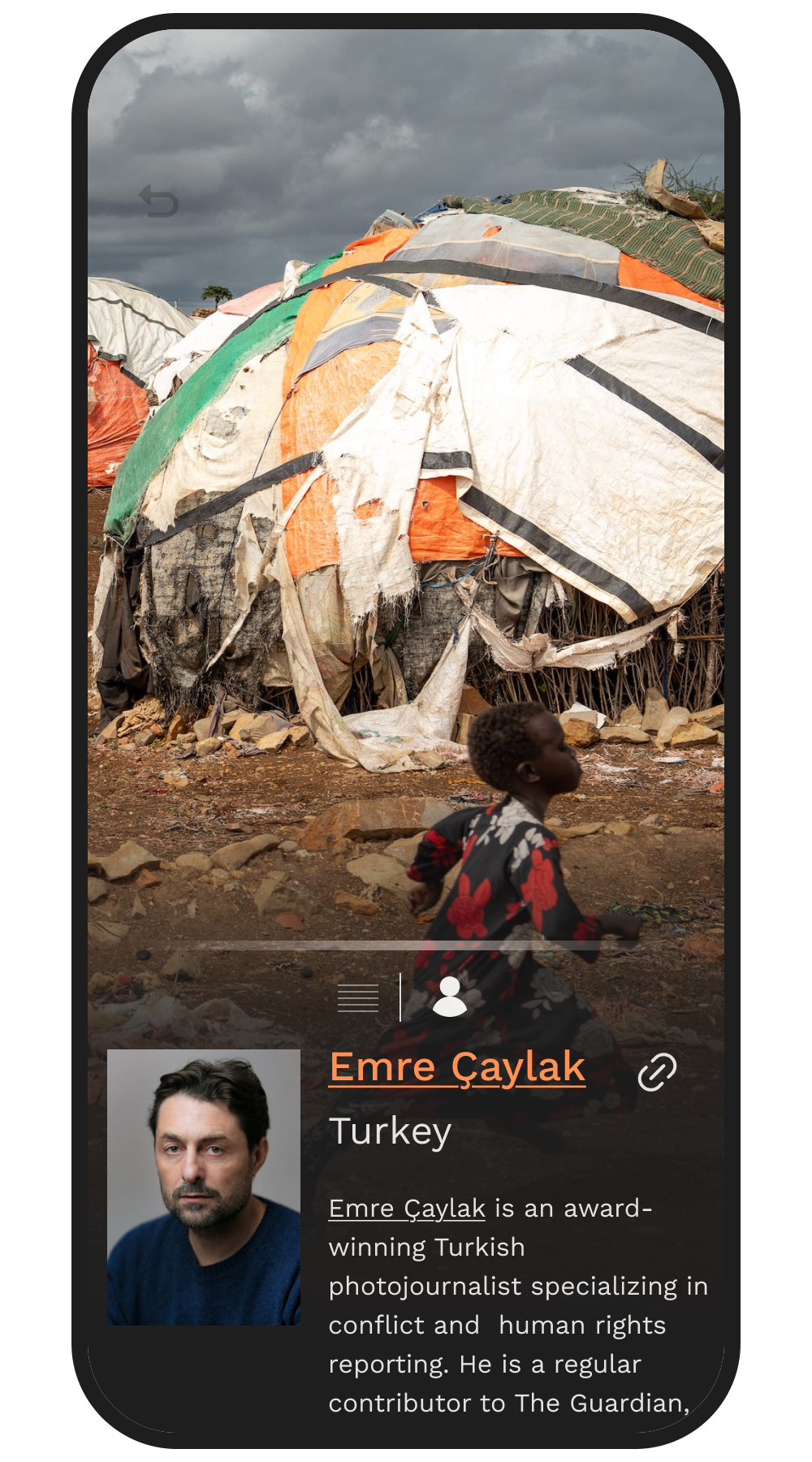
You can also tap the bar to bring up a “box” on the bottom which changes based on what the user wants to view. From here the user can still navigate and explore the images, but also swipe through the longer article text as well as view the photographer’s bio.

Story User Instructions

Story After Redesign

Story After Redesign

Article Text

Photographer Bio

The Future of Totim

Totim - Apple Vision Pro

For now Totim is limited to a 2D screen, but in the future we are aiming for a more immersive experience where you can truly travel global news. To test this out I created a mockup of how I’d imagine Totim to look in Apple Vision Pro if technical ability and story feasibility was irrelevant.

I think the future of interactive 3D spaces will introduce unknown possibilities and I’m excited to see where this goes.

(For this mockup I used an existing 3D interior rendering I created)

Totim is an ongoing project, this page will be updated as progress is made and when the updated app is live!


Totim website can be found here

Share