Totim an immersive mobile platform for documentary journalism and photography, built to help sustain the future of the free press and local storytelling. In a rapidly growing, algorithm-driven, news era, the need for on-the-ground human storytelling is more important than ever.

I joined Totim as a Product Designer to execute a complete UX/UI overhaul of the mobile app, bringing it to an investor-ready state. Throughout this project I consulted directly with the CEO to drive high-level product direction and partnered with the engineering team to ensure technical feasibility and maintain a realistic product pipeline.

The app is built on Kotlin Multiplatform (KMP). To accelerate our output and reduce my dependency on a developer, I combined Figma and Claude AI to write lightweight code to test interactive designs directly on the intended platform through either VS Code or Android Studio. This allowed me to iterate rapidly and hand off fully verified features for implementation.

User Flow

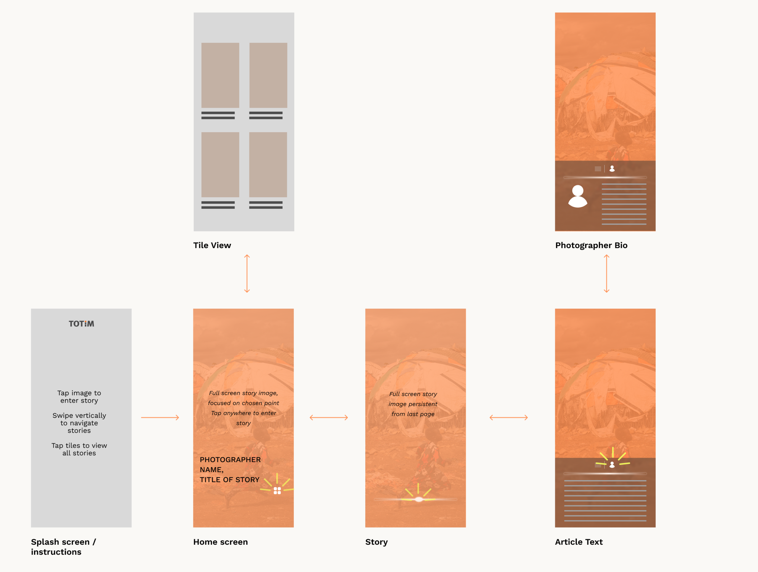
I began by wireframing a user journey that prioritized large-scale photography without sacrificing intuitive navigation.

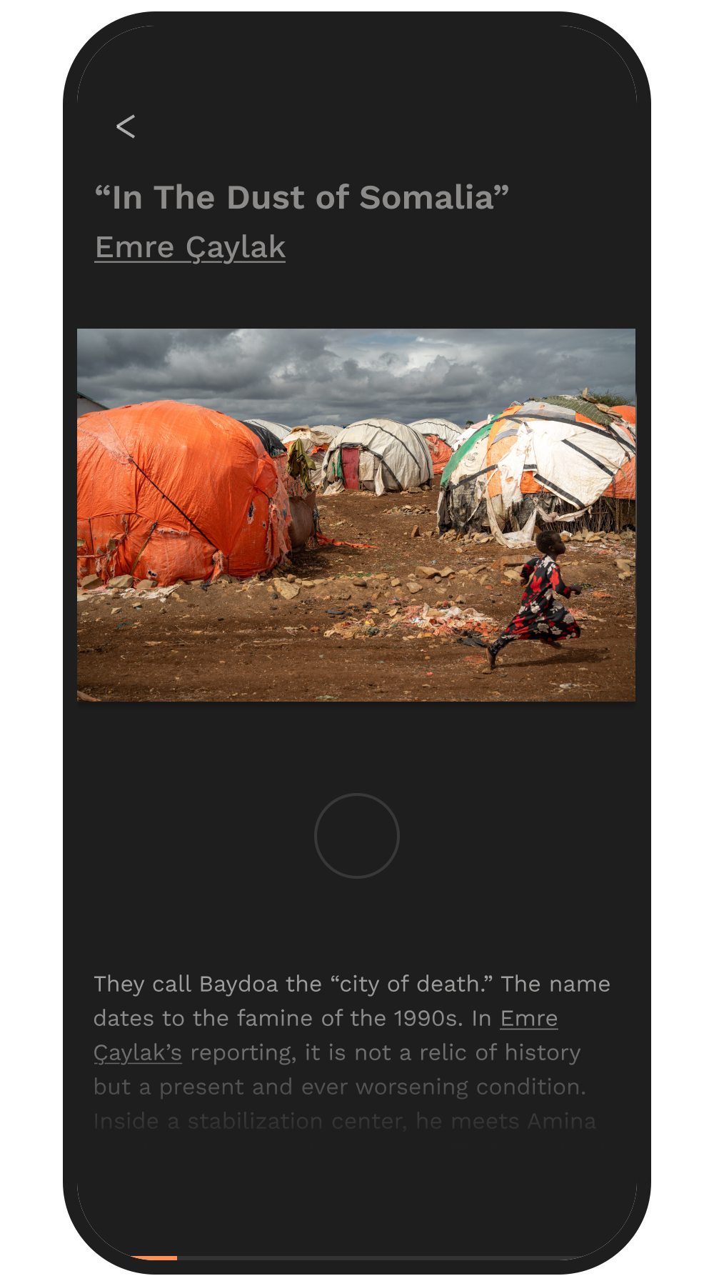
Because stories are the core of the app, I utilized full-bleed photography and a vertical swiping system that snaps to individual articles. This minimizes the steps between the homepage and the content, allowing users to fluidly scan global narratives.

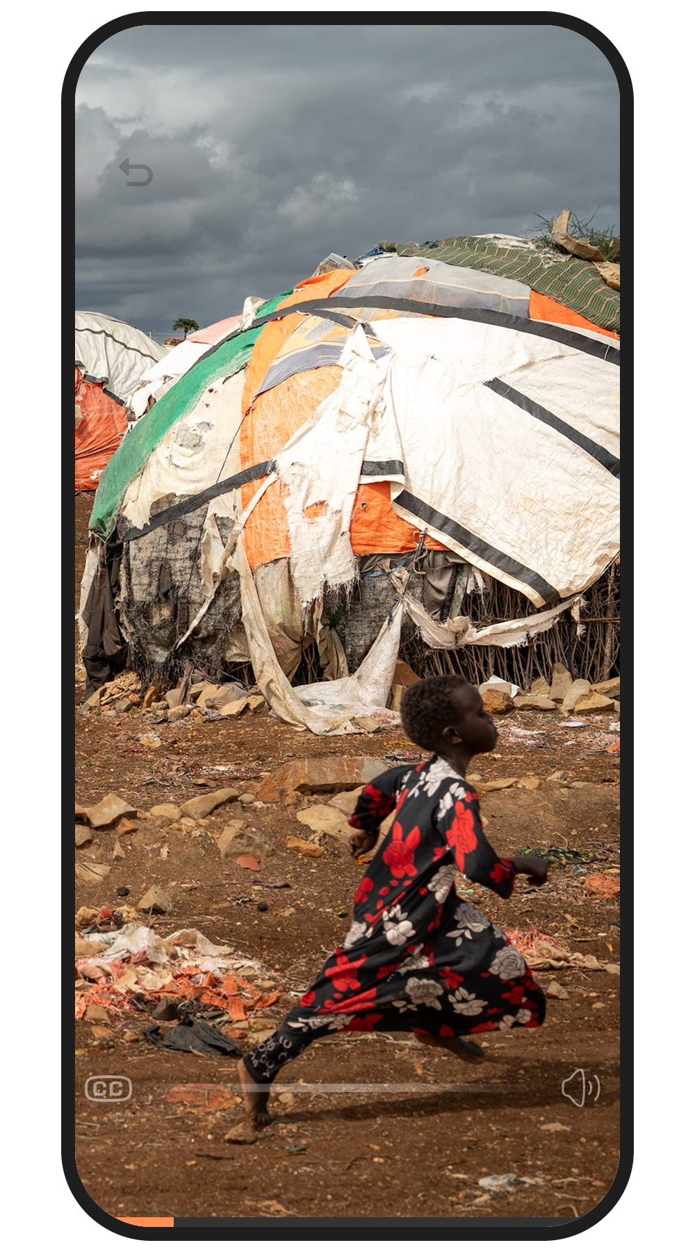
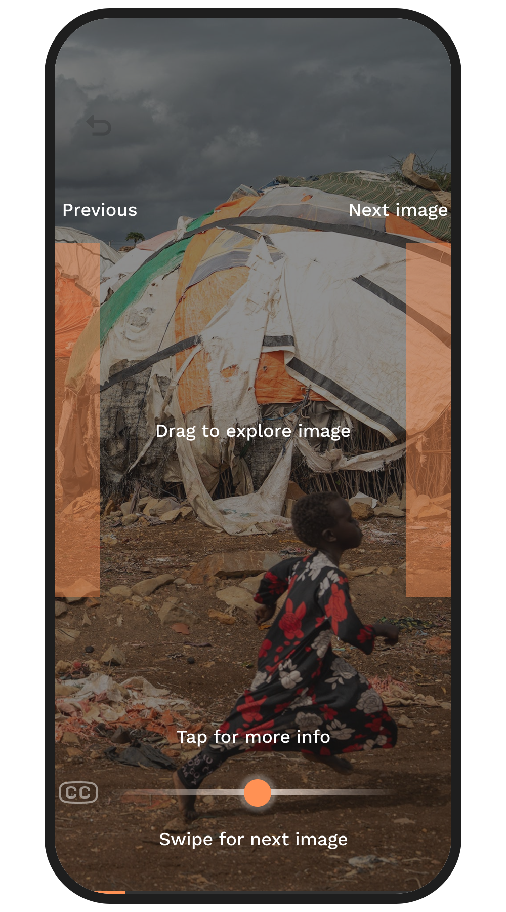
Once inside a story, the user retains total control – panning, zooming and exploring the images, whether the article text or photographer bio is visible.

Home Page

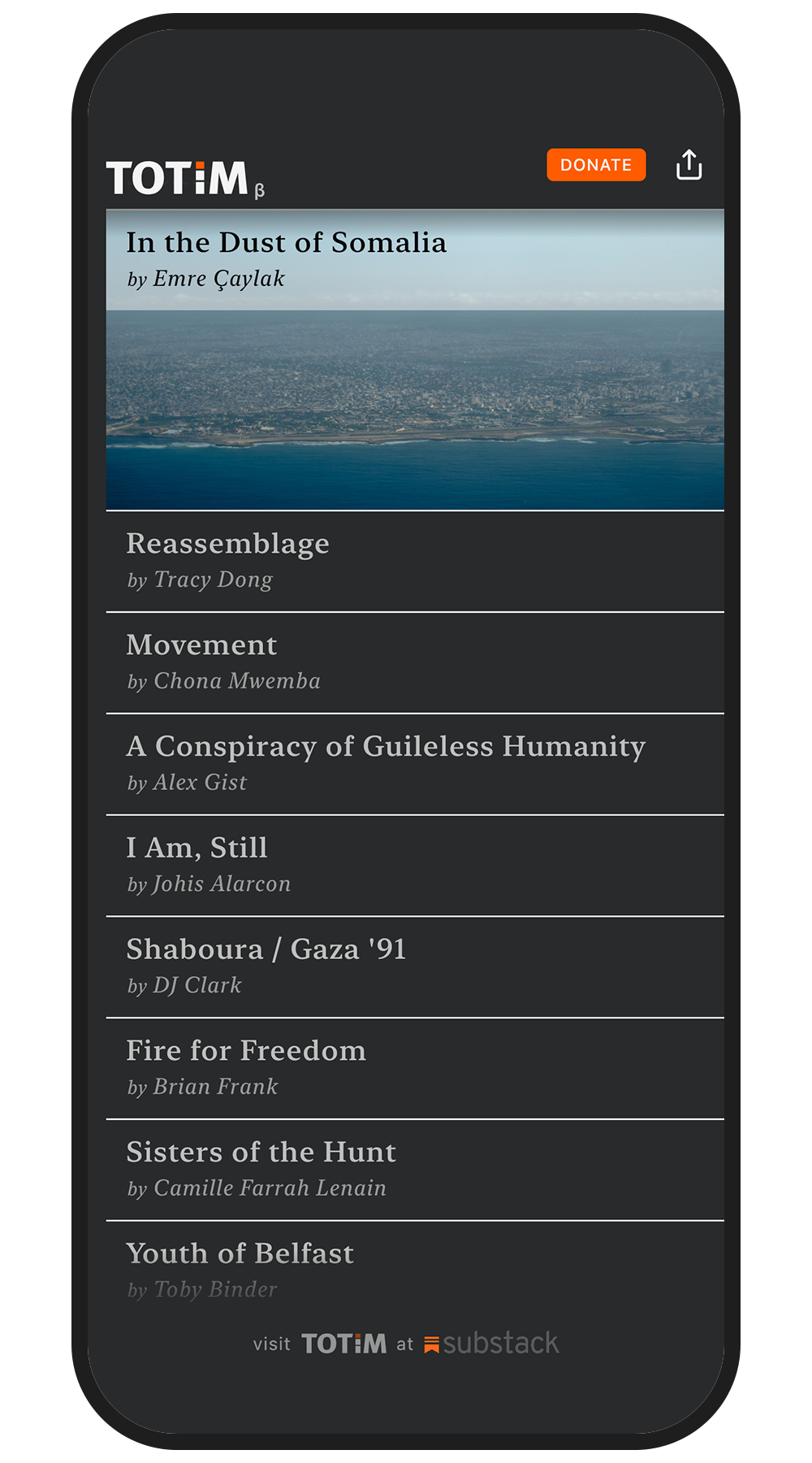
Homescreen Pre-Update

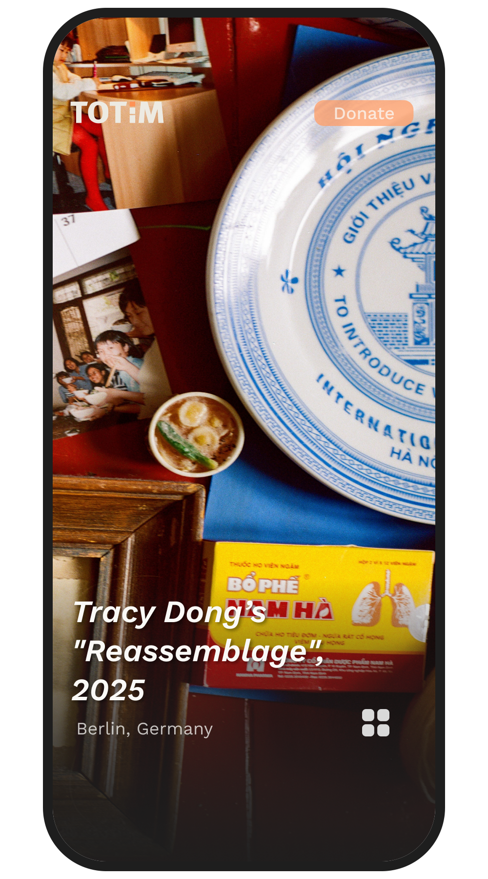
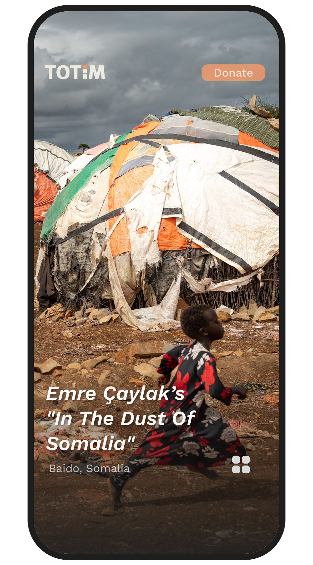
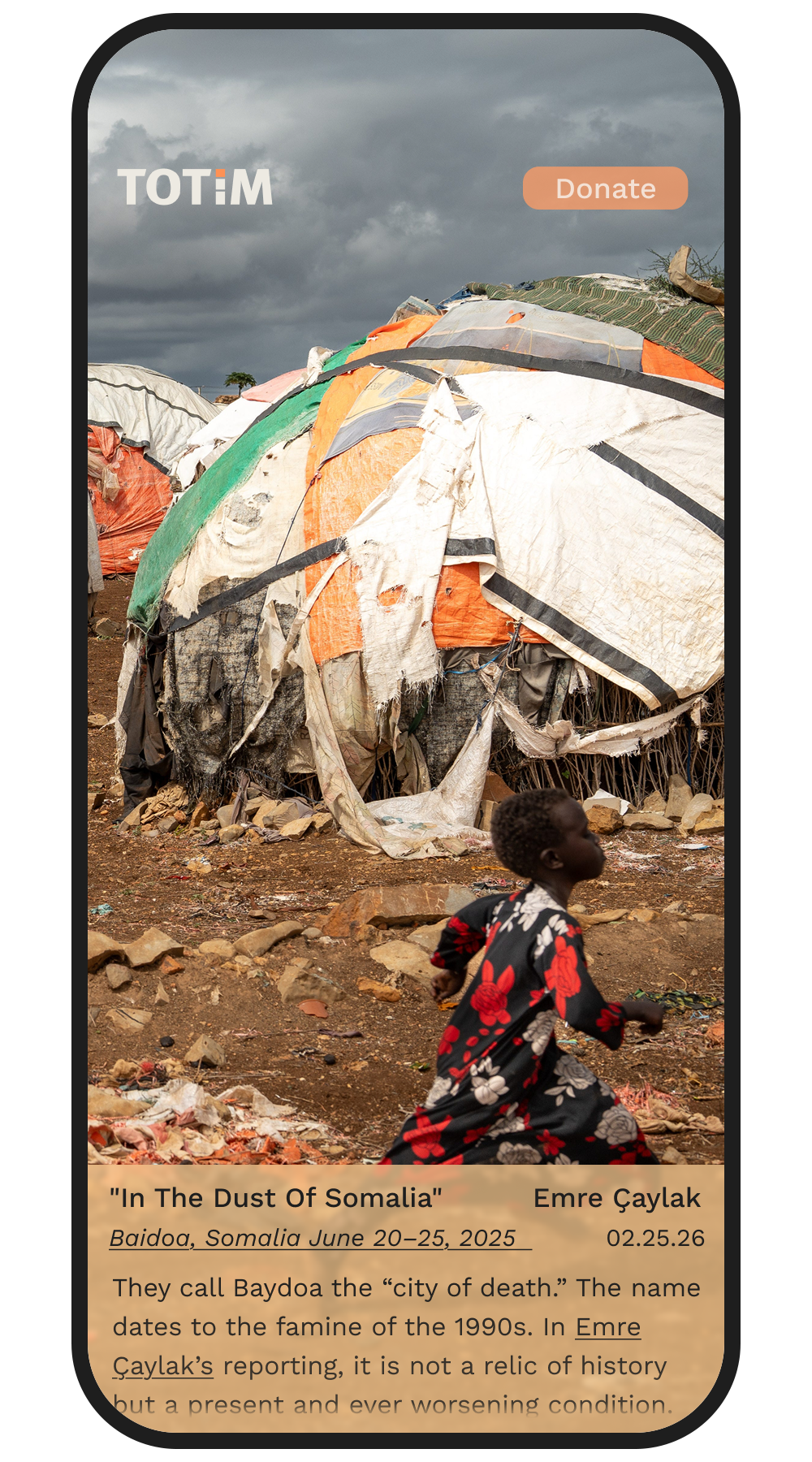
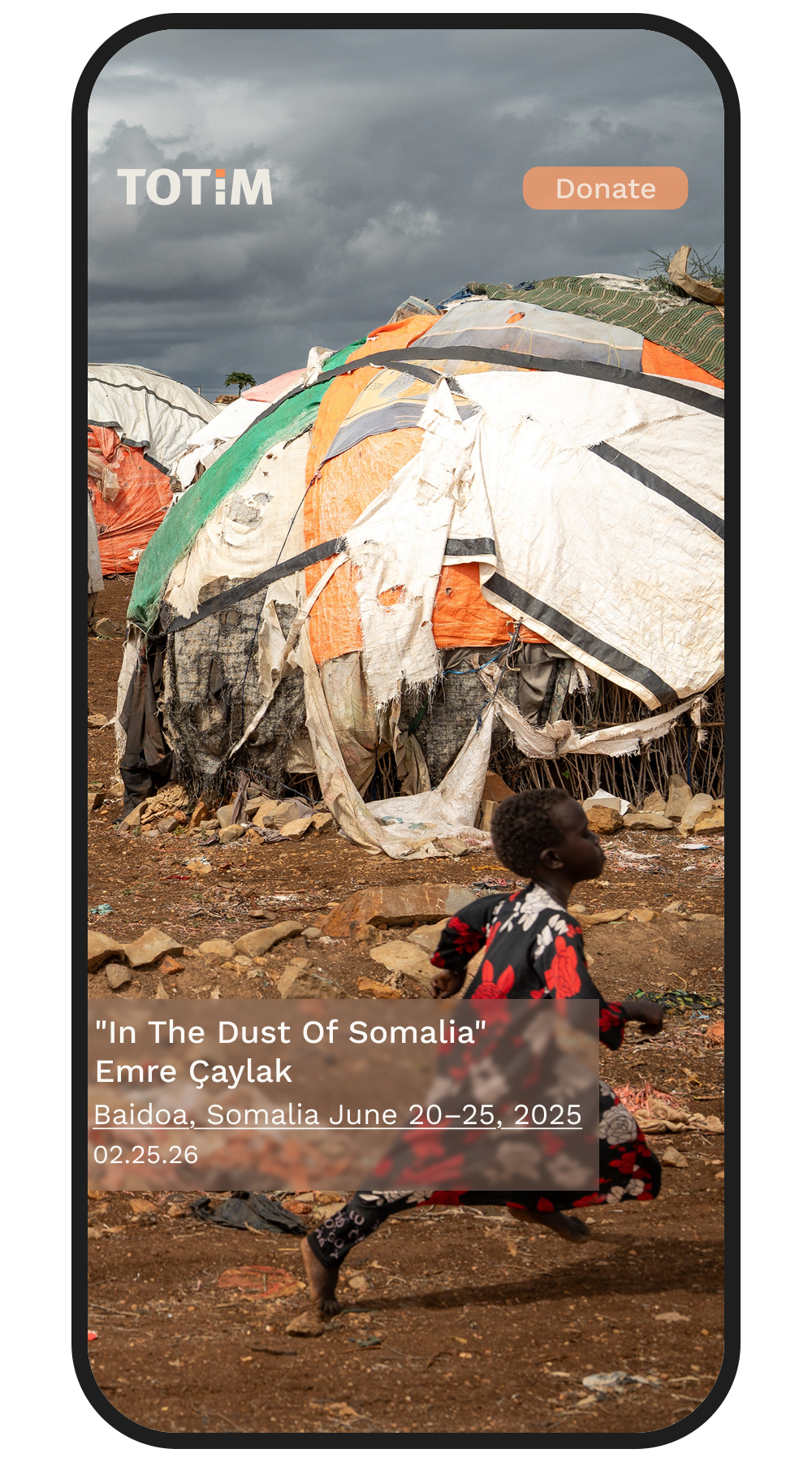
Homescreen After Redesign

As a visual-forward platform, establishing an editorial tone on the home page was my first priority. The original Totim app featured more text than imagery and drew attention away from these visuals.

The redesign required multiple iterations to solve the UX challenge of balancing crucial article metadata, along with maximum image real estate. By collaborating with the team we stripped the UI down to its absolute essentials – photographer name, project title, and location – ensuring the photography itself remains front and center.

Homepage Ideation 1

Homepage Ideation 2

Homepage Ideation 3

Homepage Ideation 3

Story View

Story Before Redesign

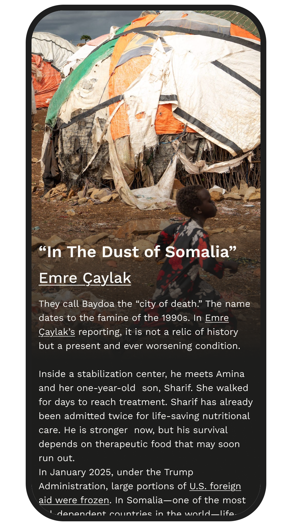
Story After Redesign

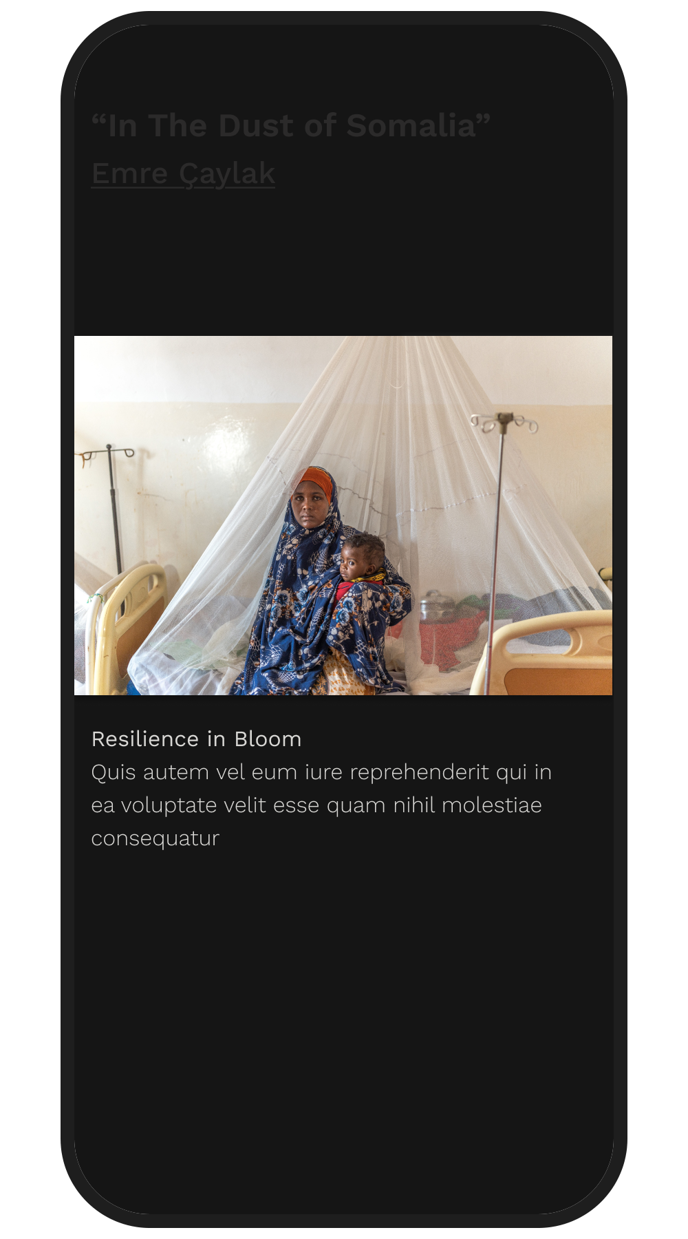
The stories themselves are multi-layered, consisting of high-resolution images, audio narration from the photographer, captions and a long-form text article. We iterated extensively to find a way to access all these components without breaking visual immersion.

Crucially, my design fit right into the existing database structure, allowing us to link to legacy assets without requiring a massive backend overhaul.

Story Ideation 1

Story Ideation 2

Article Text Ideation 1

Article Text Ideation 2

Article Text Ideation 3

Article Text Ideation 3

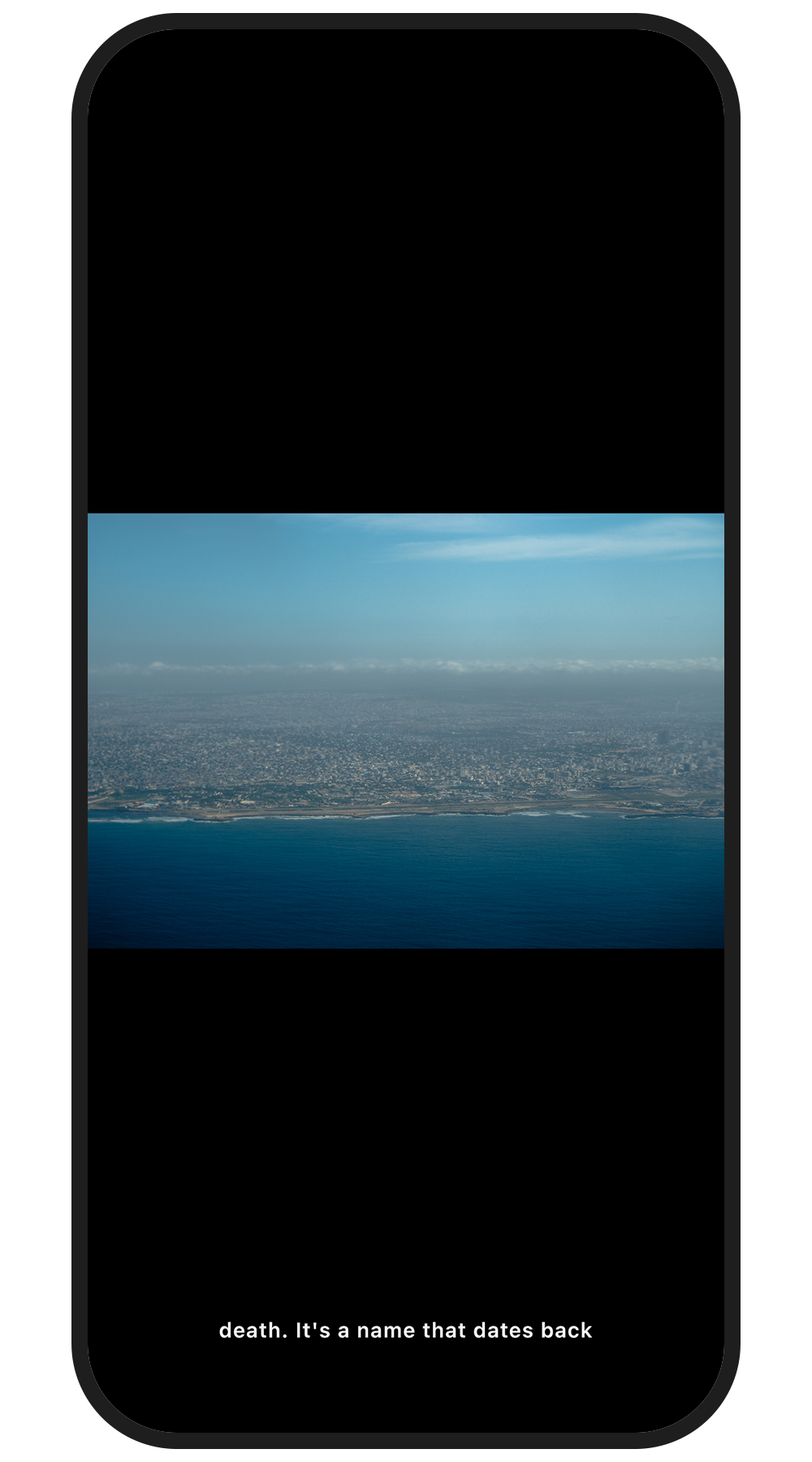
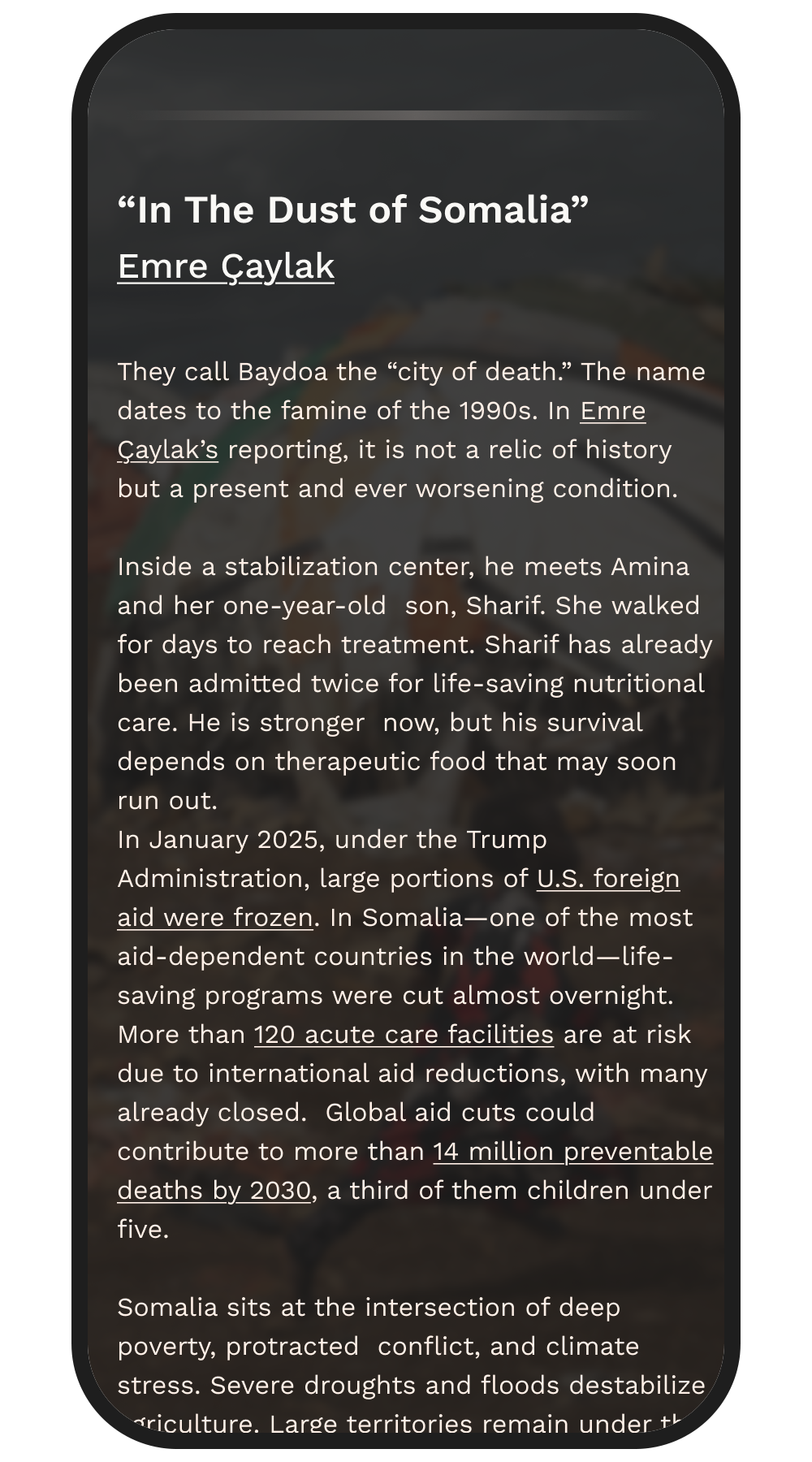
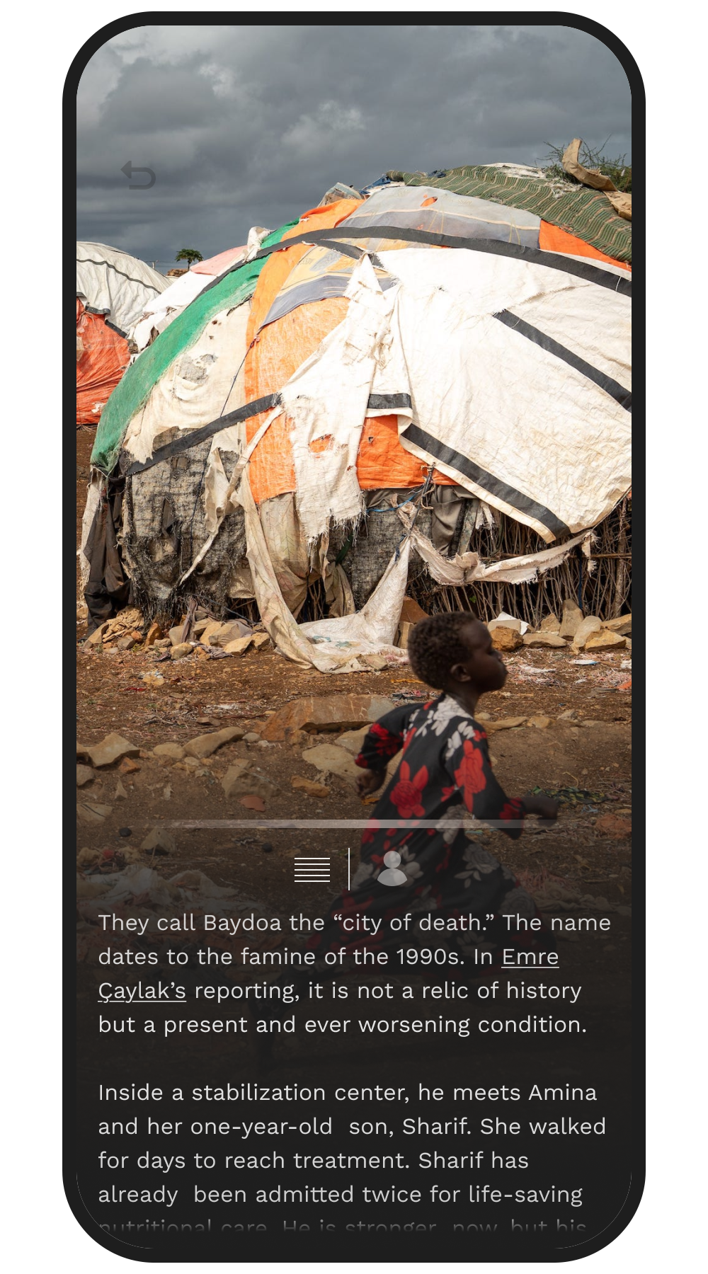
To protect the visual space, I designed a minimal, persistent navigation anchor at the bottom of the screen. The user can swipe laterally on this anchor to change images – preventing accidentally switching photos as the user is exploring the image – or tap it to reveal a dynamic overlay panel.

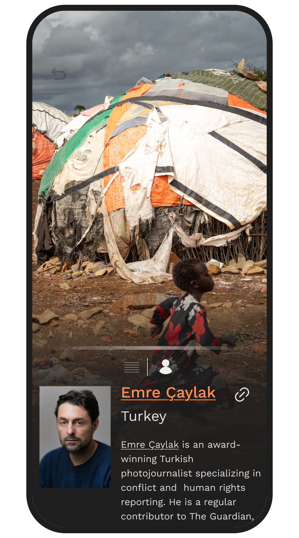
This panel allows the user to swipe through the long-form text or view the photographer’s bio while the core image remains visible and interactive in the background.

Story User Instructions

Story After Redesign

Story After Redesign

Article Text

Photographer Bio

The Future of Totim

Totim - Apple Vision Pro

While Totim is currently limited to a 2D screen, the. ultimate goal is to allow users to step inside global narratives. Leveraging my background in 3D spatial design, I modeled a concerpt of how Totim would translate into Apple Vision Pro.

As the web moves into a more interactive 3D world, I am eager to design dimensional interfaces that turn global storytelling into spatial experiences.

Totim is an ongoing project, this page will be updated as progress is made and when the updated app is live!


Totim website can be found here

Share